Document Gallery
The Document Gallery component shows a list of thumbnails linked to images.
It can be used in many ways, including showing documents from the Flowable content store based on dynamic queries.
Example: Dynamic Document Gallery
This example shows how to use the Document Gallery to dynamically display documents from the Flowable content store based on a form field selection.
Selection Control Setup
First, create an app and a single task process:
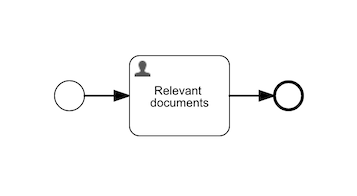
Add a form for the task with a selection control and a document gallery. We've used {{area}} as the variable for the selection.
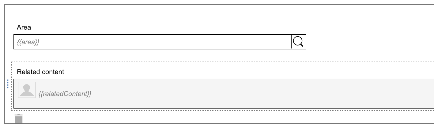
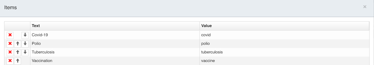
Keeping the selection control set to static values, add some items with values to be used in the search query.
Document Gallery Configuration
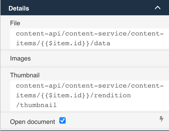
Now configure the different attributes of the document gallery. First, in the Details group, set the File attribute to:
content-api/content-service/content-items/{{$item.id}}/data
Then the Thumbnail attribute to:
content-api/content-service/content-items/{{$item.id}}/rendition/thumbnail
They use the special variable {{$item.id}} that references the ID of results from the query to define URLs to a document's binary content and thumbnail.
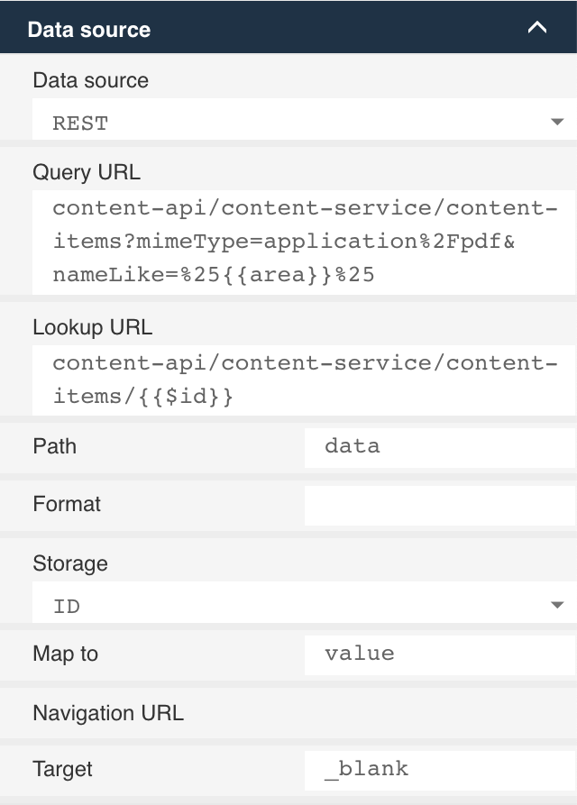
Next configure the actual query used to select the documents using the content-services API. Select the Data source as REST and set the Query URL to:
content-api/content-service/content-items?mimeType=application%2Fpdf&nameLike=%25{{area}}%25
This query uses the nameLike parameter with wildcards either side of it to match any document's name with the current value of the area variable. We've also constrained the query to only match PDF documents with the mimeType parameter.
Set the Lookup URL to:
content-api/content-service/content-items/{{$id}}
The results returned from the query are contained under data in the JSON response, so we need to set the Path attribute to data. The other attributes can be left as their defaults.
Publish and Run
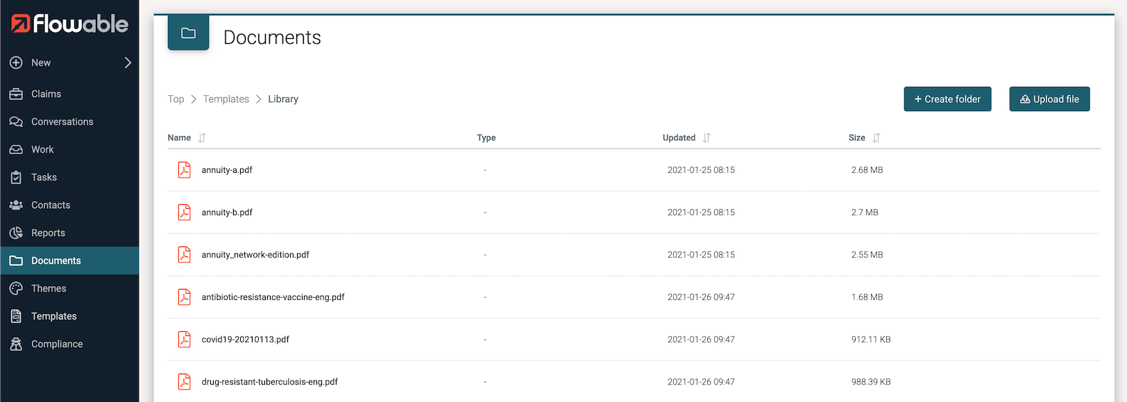
Save and publish the app and then switch to Flowable Work. We'll need some documents to search for, so create a Library folder in the Templates root and add the PDF documents you want to use here. The query doesn't constrain the match to any specific folder, so you can create whatever folder hierarchy you'd like.
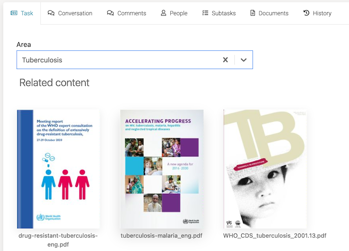
Now start an instance of the new process and view the task. Select one of the values from the selection control and the gallery should show documents with matching names. With the items above, selecting Tuberculosis shows:
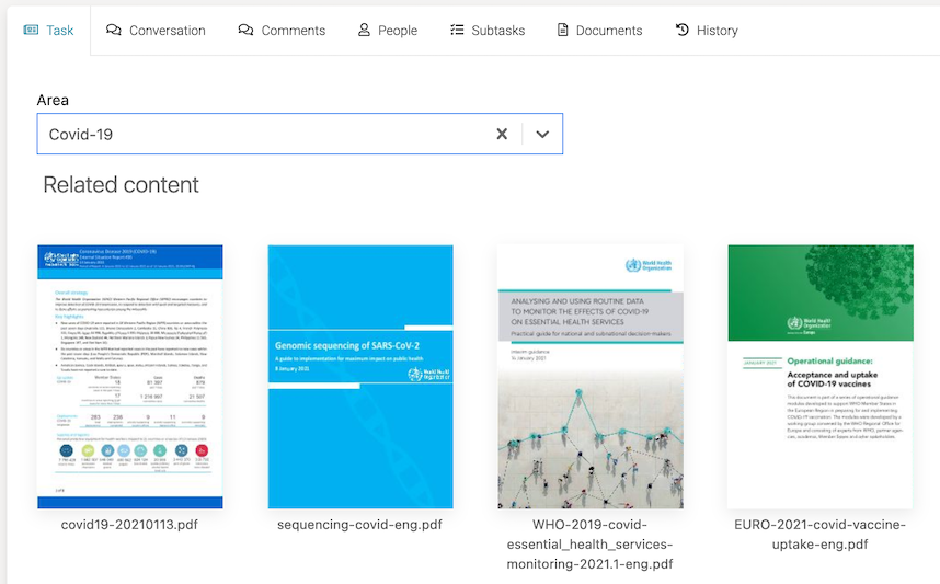
Change the selection and the gallery updates immediately. Here we selected Covid-19:
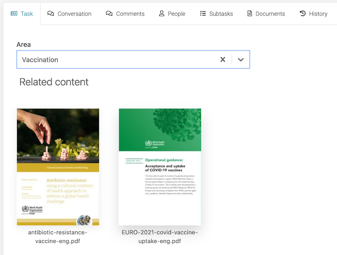
Now we've selected Vaccination, and a document that also matched with Covid is shown because its name has both covid and vaccine:
Properties
 note
noteThis component uses a Data Source.
General
| Attribute | Type | Description | Category |
|---|---|---|---|
| Model Id | String | This is a unique id for the component. | Every field on a form model needs a unique ID, which is automatically generated but can be changed if needed (e.g. to reference in expressions or for debugging purposes). If the field type supports rendering a label, and most types do, it can be configured here. This label is a displayed on the form to the end user and typically indicates what value is expected in the field. The documentation property holds free-form text that can be used to give more details about this document gallery, like its purpose, usage in other models, etc. |
| Label | Text | The label attribute adds a label to the component. | |
| Label position | Selection:
| The position of the label, you can choose between left or top. | |
| Label tooltip | Text | When it is defined, a question mark icon will appear in the component label. When the user hovers over it it will show this text in a tooltip. | |
| Documentation | Multiline Text | A free-form text to explain the use cases for this form field. | |
| Value | Text | The binding for the form field. Use an appropriate expression to bind the component to its value and specify where the value is written/read. For example, use '{{myVariableName}}' to store the value of the field in a variable named 'myVariableName'. Use prefixes to define the scope of the value, for example, 'root.' for referencing the root case/process to store the value in. Please refer to the section 'Frontend expressions' in the Flowable guide for more information. | The purpose of a form is to either display some value or to have users provide values for the various fields of a form. In both situations, this value needs to be bound to an identifier using the {{myValue}} notation, and the value provided by the user will be stored in a variable with that identifier. If there already was a value bound to the identifier before, for example because another form had a field bound to the same identifier, it will be displayed. |
| Default value | Text | If the value is not set, the default value will be used. |
Attachment
| Attribute | Type | Description | Category |
|---|---|---|---|
| File | Text | Path to files in data response. For example, {{$item.file}}. | Specific properties that change how the document gallery is displayed to the user. Check the tooltips for more information about the specific properties. |
| Images | Text | Path to images in data response. For example, {{$item.images}}. | |
| Thumbnail | Text | Path to thumbnails in data response. For example, {{$item.thumbnail}}. | |
| Open document | Boolean | Open document flag. |
Datasource
| Attribute | Type | Description | Category |
|---|---|---|---|
| Data source | Selection:
| Options to select different types of Data source. | The datasource of the document gallery configures where the data options available to the user originate from. The source can be statically defined or dynamically populated from a third party service. |
| Items | List | When using a 'static' datasource, the items need to be defined. If no values are shown, make sure you have configured the 'columns' property, as the items are defined by giving values for the different columns. | |
| Table Key | Text | Key of the Master Data Table | |
| Include Translations | Boolean | Flag indicating whether master data instance translations should be included in the fetched data. | |
| Query URL | Text | URL to request the items with optional variables. $searchText: Text the user typed if the component allows search. $start: First item index (for pagination). $pageSize: Number of items per page. eg. /rest/users?start={{$start}}&size={{$pageSize}} | |
| Lookup URL | Text | The REST endpoint URL used to retrieve the full item by ID. For example, rest/get?id={{$id}}&type={{someValue}} The URL can contain expressions evaluated against the current work object. The selected item ID is available as $id If the lookupURL does not contain {{$id}}, this will be automatically added at the end. The URL should not be encoded as it will be encoded automatically. | |
| Path | Text | When using a REST data source, this is the location in the response data to get the row collection. | |
| Data object model | dataobjectselectsearch | Defines which type of data object data is returned when using the select and which operation is used. | |
| Query Parameters | List | The query parameters that should be added to the Query URL. $searchText: Text the user typed if the component allows search. $start: First item index (for pagination). $pageSize: Number of items per page. eg. /rest/users?start={{$start}}&size={{$pageSize}} | Query parameters will be added to the REST requests that are executed when data is fetched to display in the document gallery. |
| Format | Text | An expression used to generate the label for each item. For example, Mr. {{$item.name}} {{$item.surname}} The expression is evaluated against the current work object. The selected item is available as $item. | Advanced configuration options of the datasource. Please check the tooltips on each property for more information. |
| Storage | Selection:
| Specifies how the data retrieved by the REST endpoint should be stored in the variable. Choose 'ID' if only the ID of the selected entry should be saved in the variable, choose 'Full value' if the whole object should be saved and thus making it possible to display other values of the selected element within the form as well. Pay attention as storing the full value could lead int bloating the variables with unnecessary information depending on the amount of data retrieved by the REST endpoint. | |
| Map to | Text | The attribute of an item to map to. For a Static data source 'value' is commonly used as the map to attribute and for a REST data source 'id' is commonly used as the map to attribute. | |
| Map to | Selection:
| The attribute of an item to map to. For a Static data source 'value' is commonly used as the map to attribute and for a REST data source 'id' is commonly used as the map to attribute. | |
| Track by | Text | The attribute to uniquely reference an item for tracking may improve form frontend performance. For 'REST' datasource is usually 'id', for Static data is usually 'value'. | |
| Navigation URL | Text | The URL to navigate to for the selected item. The URL might contain expressions, most likely at least '{{$item.id}}' in order to include the ID of the selected element in the navigation URL. | |
| Target | Text | Specifies the target for the navigation URL, use '_blank' to open the selected item in a new window or '_self' to use the same window for navigation. |
Validation
| Attribute | Type | Description | Category |
|---|---|---|---|
| Required | Boolean | The required flag specifies if entering a value for the component is mandatory. | Providing proper data in form fields is important, especially when in process, case, decision or any other models the values provided in the form fields are used in subsequent steps. To make sure that the data is correct, validation is crucial. For this reason, a form can only be submitted when all fields are valid and thus all validation properties configured on the left apply. Check the tooltips on the properties for more information. |
| Validation Panel Display | Selection:
| Display at validation panel and validation tooltip. | |
| Custom validations | List | List of additional validations to apply. | The document gallery can have custom validation rules beyond the standard set of validations. Such a rule is written as a frontend expression in the form of {{myExpression}}. If this expression evaluates to false, the submission of the form won't be possible. |
Rendering
| Attribute | Type | Description | Category |
|---|---|---|---|
| Description | Text | The description attribute adds a description to the component. | Some field types have an extra line of text displayed to give the user more details about the field. |
| Ignored | Boolean | If true the component will be hidden and the value will not be part of any payload. | Fields can also be shown or hidden based on the visible condition. This can be a frontend expression in the form of {{myExpression}} which can reference other form field values by their IDs. Fields can also be enabled or disabled, and similarly this can be made dynamic based on a frontend expression. Some field types can be ignored (the property is shown here if that's the case), which means that its value won't be taken into account. |
| Visible | Boolean | Boolean value or expression specifies whether the component is visible or hidden. This expression might include another value in the same form, for instance use a checkbox bound to {{showAdditionalFields}} and use the very same expression as the visible attribute to show or hide the component according the checked state of the checkbox. If you want to only show the component, if the form is not used as the init-form, you can use the expression '{{root.id}}' which evaluates to true only, if there is a current case id which is not the case in an initialization form. | |
| Enabled | Boolean | Boolean value or expression specifies whether component is enabled or disabled. | |
| Style class | Text | Stylesheet class name. Add any style classes to be applied to the component for the desired styling and rendering. | The document gallery can get customized CSS classes to customize the default styling. Note that the CSS files needed for the customizations must be available on the runtime system. |
Advanced
| Attribute | Type | Description | Category |
|---|---|---|---|
| Events | List | The document gallery emits low-level events on which can be reacted with a frontend expression to implement various use cases that are not possible with regular modeling. If the expression produces a value, it can be stored in a new variable using the Result variable property. |
List Attribute Details
Items
| Attribute | Type | Description |
|---|---|---|
| Text | Text | Label for the item |
| Value | Text | Value for the item |
Query Parameters
| Attribute | Type | Description |
|---|---|---|
| Name | Text | The name of the query parameter |
| Value | Text | The value of the query parameter. The value will be automatically URL-encoded. |
| Default Value | Text | The default value for the query parameter (in case the value didn't return anything). The value will be automatically URL-encoded. |
Custom validations
| Attribute | Type | Description |
|---|---|---|
| Expression | Text | Validation passes when this expression is true. |
| Error message | Text | Message to display when the validation fails. |
Events
| Attribute | Type | Description |
|---|---|---|
| Event label | Text | This is a unique id for the component. |
| Event type | Selection:
| The type of event emitted by the form field. |
| Expression | Text | Validation passes when this expression is true. |
| Result variable | Text | Capture the result of the expression in a result variable. |
Extra attributes
| Attribute | Type | Description |
|---|---|---|
| title | string | Path to title in data response, e.g. {{$item.filename}}. Default is {{$item.name}} |
| file | string | Path to file URL in data response, e.g. {{$item.url_file}}. Default is {{$item.downloadUrl}} |
| thumbnail | string | Path to thumbnail URL in data response, e.g. {{$item.url_thumb}}. Default is {{$item.previewUrl}} |
| thumbnailPollTime | number | Time in miliseconds to retry loading thumbnails. Default is 2000 (2 seconds). Only useful when the url specified by thumbnail setting won't be ready in time. |
| images | string | Path to images URL as Array[] in data response, e.g. {{$item.images}} |
| openDocument | boolean | When false it works as a selector: document won't be opened on click, just assigned to payload. Default is true. |
This component uses DataSource. See section DataSource.
noteAttributes title, thumbnail and file have default resolving values named as in the attachment component payload props.
This means that you can bind an attachment component value directly to a Doc Gallery items value for a Static DataSource config.
{
  type: "upload",
  value: "{{upload}}",
  ...
},
{
  type: "galleries",
  extraSettings: {
    dataSource: "Static",
    storage: "Id",
    identity: "file",
    items: "{{upload}}"
  }
  ...
}
Events
| Event | When | Additional | Cancellable |
|---|---|---|---|
DocGallery.open | DocGallery image/page is opened | Definition + State | Yes |
DocGallery.close | DocGallery image/page is closed | Definition + State | Yes |
See section Events for more information.